|
Which climbing route on Mount Hood is the most dangerous? Is it the most traveled one (south side?) 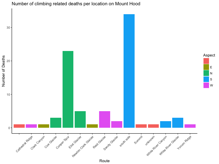 So the South side is the most popular route, hence it makes sense that most accidents are on that route; however, what I found so surprising was the number of Accidents on the Cooper Spur. This is surprising as the Cooper Spur is not a very oft-traveled route but clearly has quite a deadly reputation in this above plot. In fact, the North Side in general hosts several routes that have quite a few fatal climbing accidents (Elliot, Cooper Spur, and Coe Glacier).
0 Comments
After reading a recent article about space travel in National Geographic, I was struck by the following visualization of Astronauts journeys in space through time.  Created by Jason Treat, quite the visual! I wanted to recreate the figure and found that the dumbbell geom for ggplot2 was well built for this purpose. Now the question is what dataset to apply this to? I thought that a plot of African American legislators at the federal level would be a good place to start, which led to the following figure.
After my previous post about the size of several different cabinet level agencies, I decided to embark on a clear visualization of the percent change year to year in the number of employees in each Agency. I was inspired by the following article at the Wall Street Journal. The result is below 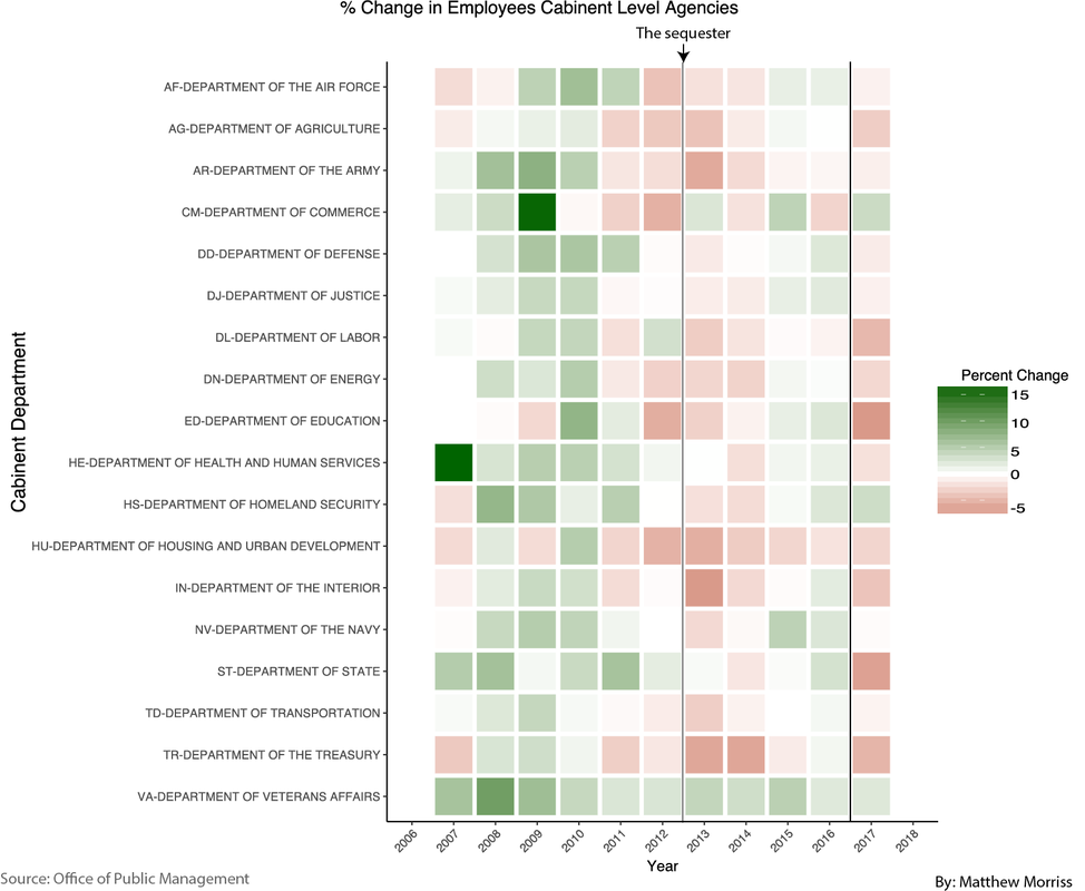 The percentage change between the number of employees in Cabinet Level agencies over the past 10 years. Red represents shrinking employment. Green increasing employment. 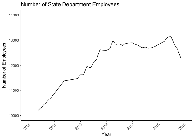 Above is the total number of employees that work for the State department by year. The vertical line represents the beginning of 2017. There is an obvious drop off... |
