|
I've updated my previous work on Administration numbers (see this post). I added some functionality wherein I now have an R shinyApp up and running that will change the plot to be a Cabinet Level agency of your choice. Check it out and lemme know what you think! 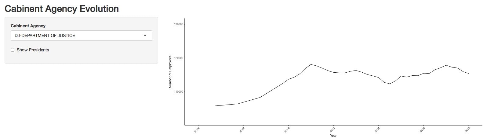 Preview of Shiny app Click to access
0 Comments
As a PhD student in Tectonic Geomorphology, I spend a lot of time analyzing topography. One of the tools I have often used is TopoToolBox. This Matlab native toolbox has any different suites of topographic analysis and is specifically geared to analyze river networks. One analysis that I have made use of that is not built into TopoToolBox is comparing the hypsometry (or distribution of elevations) to the slope and relief in each elevation band. I describe herein a tool I developed to approach such a problem, built to work within the TTB environment. 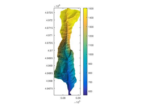 Here is a catchment from my dissertation area in eastern Oregon. Note that there is a sudden increase in the steepness of the topography about 1/3rd of the way from the headwaters to the mouth. 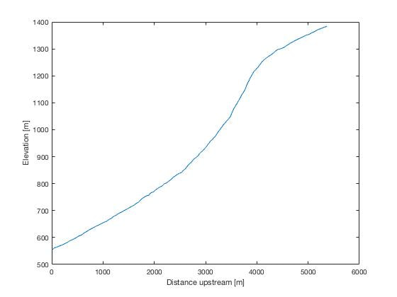 The long profile of this stream reveals a sharp change in gradient, or knickpoint. This knickpoint could be a transient signal, transmitting information of base-level lowering to the catchment above. This means that the slopes above the knickpoint are unaware of the lowering-event the bottom portion of the catchment is feeling. My new function GridCompare, which takes the following inputs:
Example code: load DEM.mat %Load premade example DEM (from above illustration) gridcompare(DEMoc); % run grid compare. The result is below: 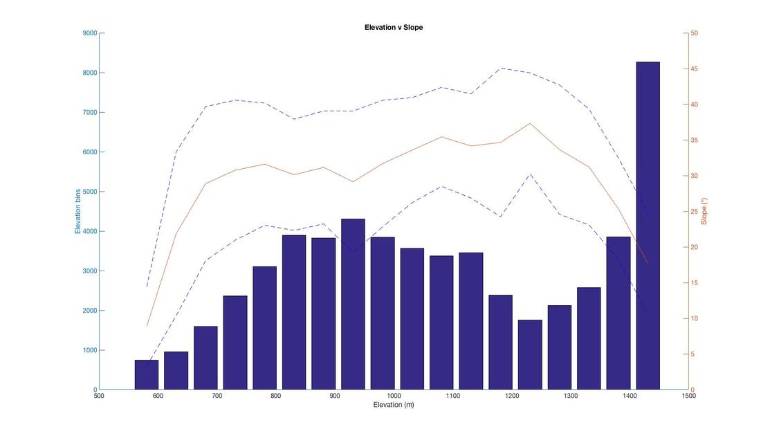 Plot 1: Hypsometry (blue bars) vs the mean slope (red line) and σ-1 of slope (dashed line) in each elevation band. The first thing to note is that there's an accumulation of topography at higher elevation >1400 m. Secondly, this elevation band has much lower slopes than other elevation bands <15° average slopes compared with 25-35° slopes below this elevation 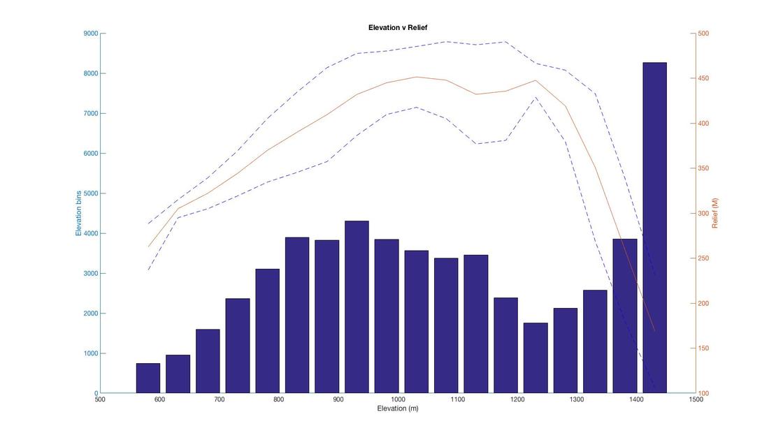 Plot 2: Relief v Elevation. Relief is calculated in a 500 m moving window across the grid. Similar to Plot 1, the higher elevation with greater area has lower relief. To some extent you may expect this trend in non-glaciated landscapes where as you approach the tops of mountains, there is less and less available topography for relief! But the correlation to the higher elevation region is remarkable. This tool is available at my Github Page with this example.
|
