|
With all of the events going on right now, horrible wild fires, Covid-19, etc. It may be easy to forget that in the early days of spring, few people were driving and it felt like Salt Lake City had some amazing air quality. There were many articles at the time about how air quality around the U.S. and the world were having a moment during the lockdowns. I got curious now that we are into the later half of 2020, if I could take a rather pedestrian analysis of Salt Lake City air quality monitors and compare the spring of 2020 to other years of the recorded environmental variable air quality index in Salt Lake City. Data source: EPA air quality monitors 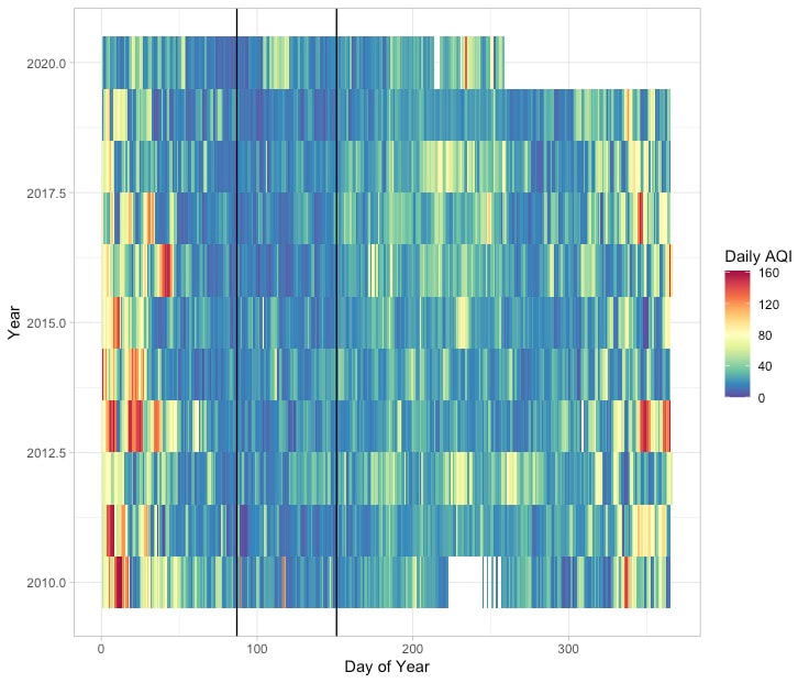 Figure 1. Heatmap of the Air Quality Index (AQI) for 2020 and the past 10 years. Black lines highlight the region when Utah instituted "Stay Home, Stay Safe" when we had minimum car in the Salt Lake Area. The above heatmap shows the annual trends in Air Quality in the Salt Lake Valley. Winter months (at beginning and end of plot) have the highest AQI values (worst air quality), likely associated with the known phenomenon of Winter Inversions in the Salt Lake Valley. The warmer colors mid-summer could be smoke (?) from local or regional forest fires? I know that the very red bar on day ~265 in 2020 and associated warm colors on neighboring days are smoke related. What this heatmap also appears to make clear is that the early months of 2020 had relatively good air quality – even before lockdown started. In fact, the time period between the start and end of 'Stay Home Stay Safe' (black lines) did have a relatively low AQI value but compared with some other years in the same period there was a week or so period with worse air quality at approximately day 100. Despite the very clear air we could see during the lockdown period perhaps it was not cleaner than could be typically expected of a spring in SLC? Will try to examine this below 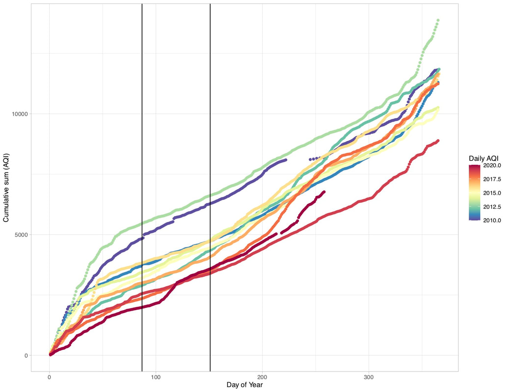 Figure 2. Cumulative AQI for the past 10 years in Salt Lake City (station 490353006). Lines are colored by year. 2020 is the incomplete line with the warmest color. Black lines are the dates over which the State of Utah instituted "Stay Home, Stay Safe." The above cumulative AQI plot shows that of the past 10 years, 2020 was already off to a fairly clean start in terms of air quality (lower slope of the cumulative curve). The slope of the period within the "Stay Home, Stay Safe" dates is actually one of the steepest parts of the 2020 curve, which is remarkable given how many cars were NOT on the road. I'm curious about this event that happened just after day 100 of 2020, but haven't looked at it in more detail. There is also the possibility that reduced traffic from increased working from home throughout 2020 will result in a more systematic change in 2020 air quality in Salt Lake City; however, this would require a more detailed analysis than what I've done herein. Perhaps one the calendar year is up, others will be actively working on this problem (I'm sure the papers will be out soon). 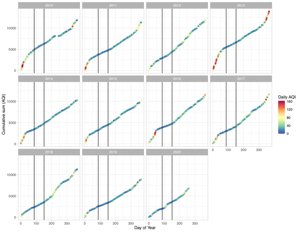 Figure 3. Cumulative Daily AQI by year broken into sub plots. This approach allows for easy comparison between the daily values of AQI responsible for the cumulative curves. The black lines are again "Stay Home, Stay Safe" restrictions. N.B. that the 2020 Daily AQI curve is less steep by day 100 than 2019 and most of the other years plotted. When cumulative AQI is broken out into separate plots for each year, the period of lockdown in Salt Lake is visible more steep, not less steep than at least 4 of the last 5 years. And I would argue (based on visual comparison) that 2020 overall doesn't look like a less steep curve than 2019. In fact, the cumulative AQI value for day 250 in both 2019 and 2020 – 5527 and 6451, respectively, are the inverse of what we might expect if 2020 had cleaner air overall. Clearly a lot of interesting data out there. Curious to see how it will be analyzed in the future. This is a very curious and not super statistically robust analysis. I am excited for more in-depth time-series analysis to be brought to bear!
0 Comments
I recently attended the annual post-AGU Gilbert Club meeting in Berkeley California. One of the keynote speakers was Gordon Grant, a professor from Oregon State U. He gave a fantastic talk about the differences between working in a volcanic landscape like the Oregon cascades and a "typical" landscape without kilometers of highly permeable basalts. One thing that has stuck with me since his talk was the following figure. 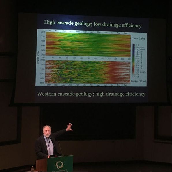 Gordon Grant showing the discharge from two different Cascade rivers, visualized as a heatmap. I was inspired by Gordon's beautiful visual aid to try and construct a similar figure using data from my new home, Utah. In this case, I chose the Great Salt Lake as a reference and one of the major rivers that feeds the lake, the Bear River. I also chose to use R, rather than the proprietary software package Gordon used.  Bear River catchment and Great Salt Lake 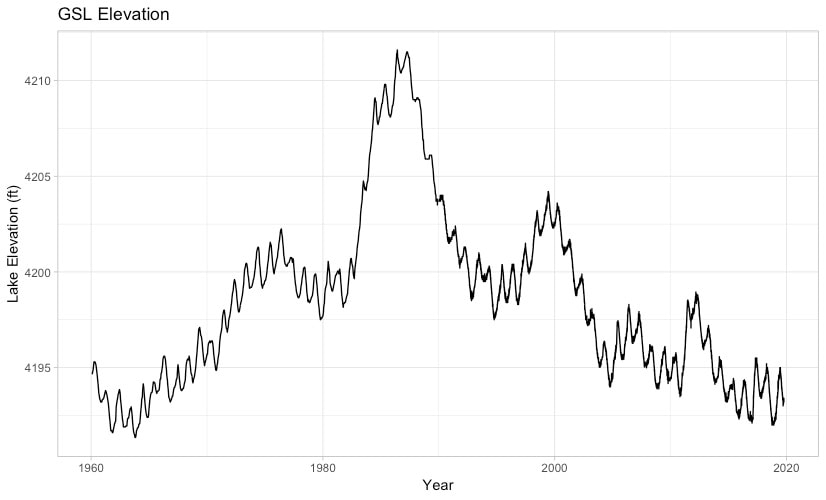 Above is a typical time series plot of GSL elevation. It provides a lot of information over time about the trends in Lake Level. However, the annual fluctuations are more challenging to piece apart. 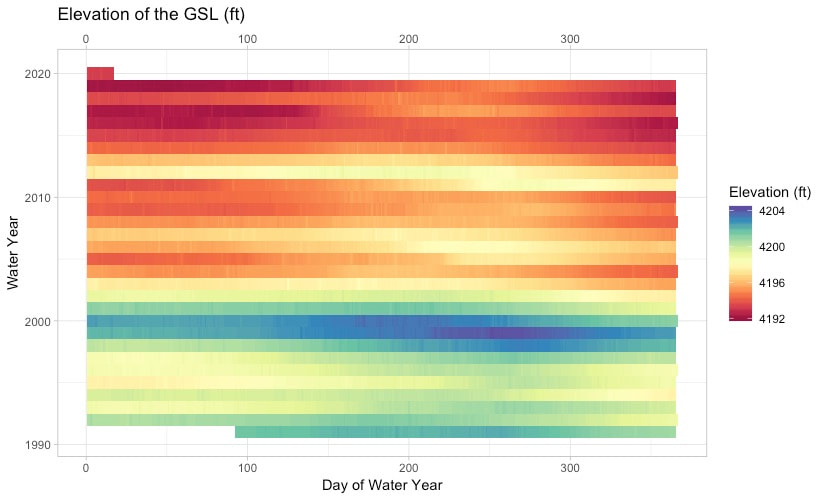 Heat Map of Great Salt Lake elevation. The elevation of the Great Salt Lake, once plotted by the water day v water year, with the third dimension being color, really comes to life. The high stand around 2000 really stands out, and the high stand in 2011, which was a particularly wet year, is less perceptible. 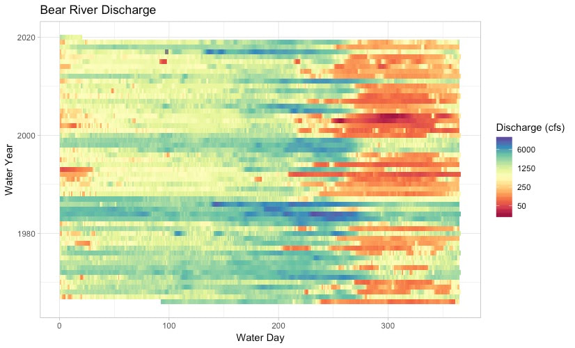 Bear River heat map. The heat map for the Bear river is also really helpful in visualizing the changes through the seasons and years. For instance, there were multiple high flow years in the early 1980s, where the river dropped a little in the summer but not like the "typical years." The same goes for the high flow years around 2000.
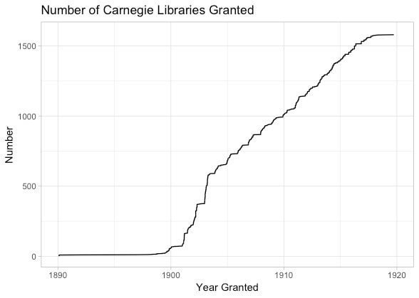
The code to make these figures isn't that complicated, and I think it's a really neat way of showing river discharge or time series in general, to look for trends through time. Code Located here ---> LINK Files located in this folder --> LINK I recently got a bee in my bonnet about how to further inspect the listing and de-listing of Endangered Species through time. The Endangered Species act was passed through congress and signed by President Nixon in 1973. It turns out that it is actually quite challenging to locate a singular list of species that have been listed in the past but have been removed from the Endangered Species protections. However, I was able to located a source of data from Ballotpedia, here. This provided me with the raw data to start making a few fun plots. 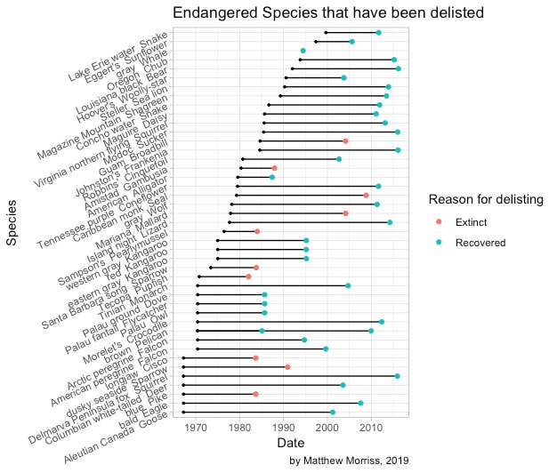 Since its inception, 44 species have been listed and then de-listed from the Endangered Species act because of either 1) extinction or 2) because the species recovered sufficiently for delisting. 10 Species have gone extinct, while 34 have successfully recovered. Here Species are listed by their initial listing date. 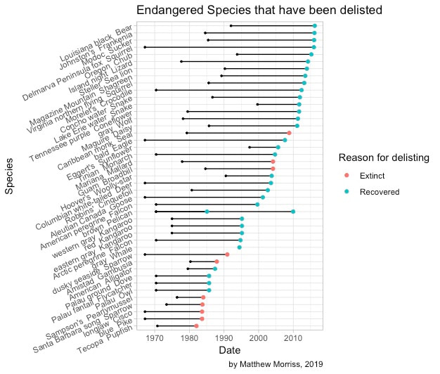 Species are now listed by the date they were taken off the Endangered Species List. Note that there is a higher density of Extinct species in the earlier days of the Act. Also only one subspecies of the gray Pelican was removed from the ESA listings, hence the two dots. In an attempt to broaden my web scraping capabilities, I decided to try and compile a list of all of the Carnegie Libraries in the U.S. which are currently spread across many different wikipedia pages. Took a little work, but I was able to extract a file containing 1593 libraries out of the total 1,689 built in the United States. Mostly this is because Philadelphia caused some coding problems and I didn't include Washington D.C. either. Below is a csv file with all of the compiled libraries. By their name, date they were granted and grant amount. I then decided to do some basic analysis and visualization of the libraries.
 Number of Carnegie Libraries over time, fairly linear after 1905. 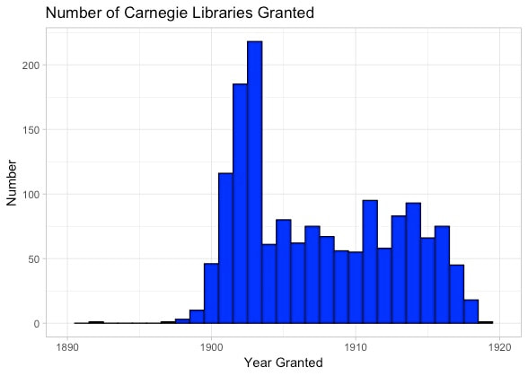 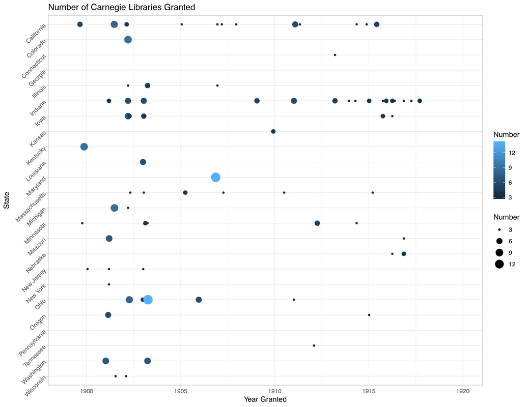 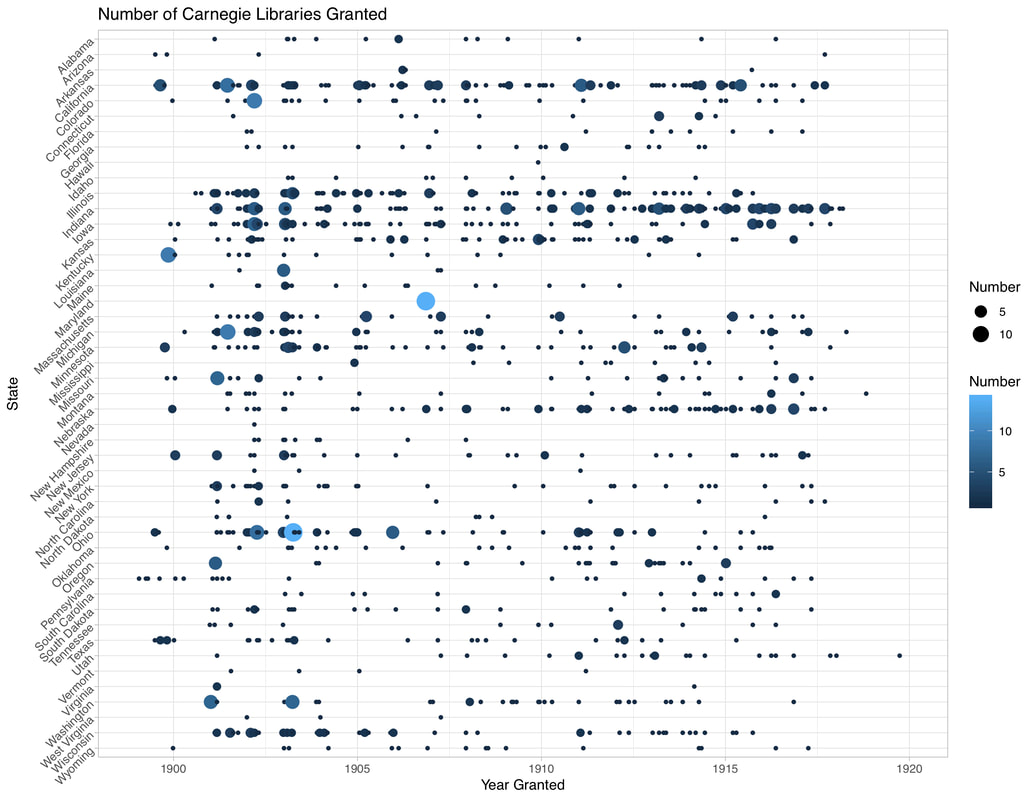 While things here have been pretty quiet for a while, I've been slowly making progress on a detailed analysis of Obama's Judicial appointments. In his 8 years in office, Obama nominated nearly 400 justices for judgeships throughout the Federal judiciary (see nominees here). Of these nominees, only 334 were what we would deem "successful" or passed through the Senate and were confirmed. The confirmation process was not without turmoil. Specifically, I am thinking about the Republican majority that took control in 2015. After early successes in appointments, the Obama administration was hampered by Republican stonewall, the most famous example is Merrick Garland. But there are other examples (see here). I undertook an investigation of Obama's judicial nominees to examine the following details:
With the help of the Ballotpedia tabulation of Obama's nominations, and the Gender package in R, I was able to extract the gender of the nominees and other data associated with when they were nominated. See Figure 1 for the gender of the nominees: 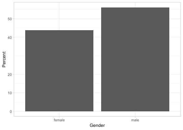 Figure 1. Percentage split between Female and Male judicial nominees under Obama. Not quite 50:50, Male = 57 %; Female = 43 % In the aggregate, Obama did a fairly good job nominating judges who were of both genders. It has been a priority since Johnson for Democratic presidents to push for diversity in their judicial appointments (Asmussen, 2011). How about the ratio between gender and whether or not the nominee was approved? 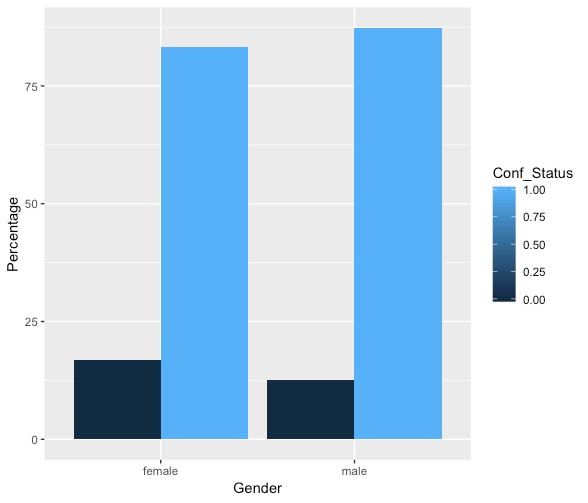 Figure 2: Percentage of judicial nominees approved by Gender. Female Approved = 83 % Female not Approved = 17% Male Approved 87% Male Not Approved 13% (I realize the color bar as a 0 - 1 scale doesn't make sense) A slightly higher proportion of female candidates were not confirmed as compared with male candidates... And recall that this plot is for all candidates over the 8 years Obama was in office, so let's examine the confirmation percentage breakdown on a yearly basis. 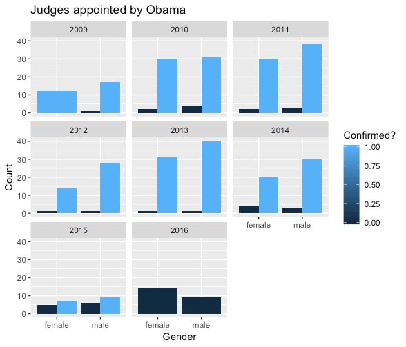 Figure 3: Gender split on confirmed and not confirmed. Remember in 2015, the Republicans took control of the Senate. 2016, the election year, saw no nominees - of either gender - confirmed. The above plot (with an error in the 2009 facet) shows that for most of the Obama years, 2009 - 2014, the likelihood of success for both female and male nominees was high. By the time the Republicans took control of the Senate in 2015, the number of nominees falls at the same time the number of nominees not confirmed rises. It's hard to test my hypothesis regarding the possible gender disparity in the nomination process under this framework, but it would appear in a subjective manner there is not a clear disparity - except that for the most part fewer female nominees were put forward over these 8 years which we know already (see Fig. 1). Instead of a histogram, let's take a look at all of the nominations over time, one way to do this is a Jitter Plot. 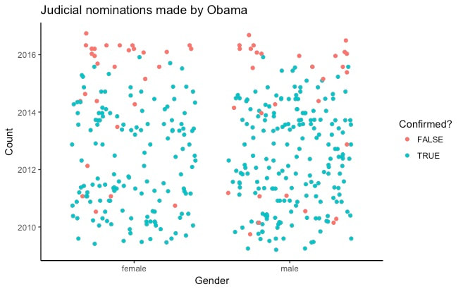 Figure 4: Jitter plot of Obama judicial nominees. Colored by their confirmation status and separated by Gender. The jitter plot reveals more subtleties hidden by the histograms in Figure 3. Pre-2015, few judicial nominees failed to be appointed, and it looks like those may have a random distribution through time - perhaps something about the nominees specifically made them less favorable to sit on the federal bench. Until, beginning in 2015 more red circles start appearing and by 2016 almost no nominees are confirmed through the Republican controlled Senate. 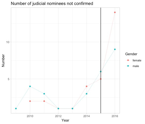 Figure 5: Number of judicial nominees not confirmed through time. But these last few plots don't really tell us anything new. I started this story by talking about how fewer judicial appointments made it through the Republican controlled upper house of the legislative branch. Perhaps another way to look at the question of gender difference in Judicial appointments is by the amount of time between nomination and successful appointment. The question being: Does the Gender of the nominee effect the amount of time before confirmation? 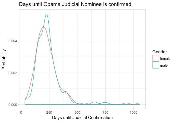 Figure 6: The PDF of Days until confirmation of all 334 successful judicial nominees during the Obama Administration Figure 6 shows the distribution of "wait time" for nominees between initial nomination and successful appointment. The median for female nominees is 212 days while for male nominees it is 223 days. That is to say, there is barely a difference between the two genders. But again, is that the case through time? 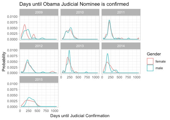 Figure 6, Days until judicial nominees appointment, by year and gender. Looking through each year of the Obama administration the overall shape of "wait time" for judicial nominees is fairly similar for each Gender. If anything the years of 2009, 2013, and 2015 look slightly more right skewed, with female nominees being approved after a shorter period than their male counterparts. However, merely examining the PDFs of "wait times" by gender doesn't give us the most quantitative look at the differences between the Gender of different nominees. For that, I'll turn to the Boxplot (see Figure 7). 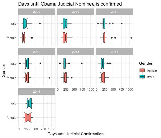 Figure 7. Boxplot of Days until Judicial confirmation by year and Gender Figure 7 is the exact same data as Fig. 6; however, I've used notched boxplots instead of PDFs. For a description of how these work, see Fig 8. The notch width corresponds to the 95% C.I. around the median. This allows for rapid hypothesis testing visually from whether or not the C.I. of two different samples are overlapping. While not exactly the same as some of the common frequentist statistical tests it allows us to at least say whether there is "strong evidence" that the medians differ (more here). The C.I. overlap for all years except 2009. This means that 2009 is the year in which we have 95% confidence that female judicial nominees had a shorter "wait time" between nomination and confirmation than did male judicial nominees. I won't hypothesize too deeply on this but perhaps the super majority in the Senate in 2009 and the fresh fervor of a diverse presidential candidate spurred action to nominate and confirm female justices quickly? Turns out The Alliance for Justice has already written about this here 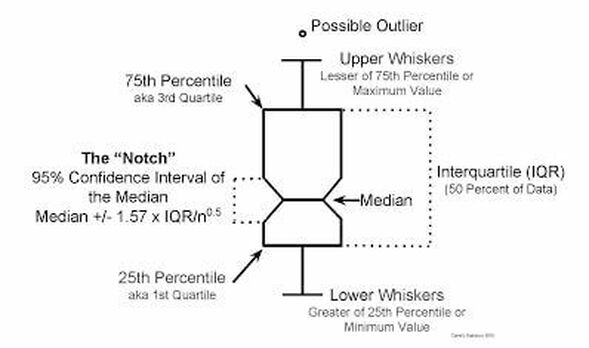 Figure 8: Notched box plot Given the results of Figure 7, I can say that the only statistically significant difference in "wait times" between genders occurred in 2009. But I still haven't really tested whether or not female judicial nominees were less likely to be appointed than their male counterparts. For this, I will need to treat successful nomination as (1) and failed nomination as (0), with an X-axis of time. This is a perfect scenario for making use of a logistic regression. 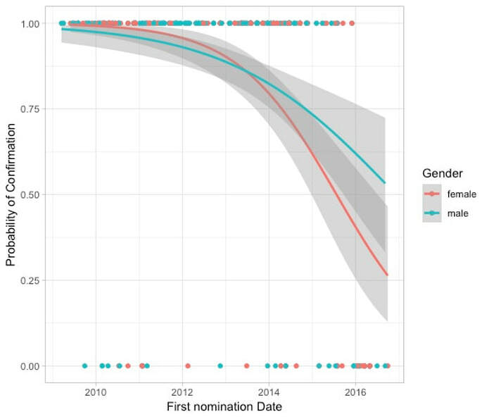 Figure 9: Logistic regression of Obama judicial Nominee success by nomination date. With Figure 9, we are finally honing in on the question of Gender based discrepancy in the approval of judicial nominees. We've already looked into whether or not for successful nominees females or males were approved of more quickly. Now, the logistic regression allows us to examine whether or not there were changes over time in the success of a nomination and evaluate any possible gender based discrepancy in this change.
Initially, (2009 - 2013) the regression indicates that female nominees (on average) had greater success in getting confirmed than male nominees. This is a reflection of the data show in Figure 5; however, the overlapping C.I. indicate that this difference is not statistically significant. The success of female nominees drops sharply after 2014, and hence the number of female nominees not successfully appointed to the judiciary also climbs (see Fig 5). Notably, this trend begins before the Republican part takes control of the Senate. Importantly, the trend of female nominees continues downward at a faster rate than the male nominees in 2015-2016. Taken at face value, or "on average" this would mean that female nominees were less successful during this time period than their male counterparts at being confirmed. Success right? We've proven! that the Republican controlled congress displayed some form of gender bias in their confirmation of Obama judicial nominees. Unfortunately, it's not entirely that straightforward. Given the significant overlap, between the C.I. on each regression it is not necessarily statistically significant that Republicans were more likely to vote to confirm male judges than female judges. Additionally, the dates on the X-axis are First nomination date. This only shows when were nominees brought forward and nominated by then President Barack Obama. This is not entirely a random process and perhaps there were more female candidates for nomination in late 2015 early 2016 and that's why this trend appears so sharp? Basic Conclusions:
|
|||
