|
In a previous blog post, I examined the distribution of gender for invited speakers at the 2018 Geological Society of America Meeting. I did this by hand with the conference schedule printed out. But I wanted to go one step further and see if I could extract long-term trends in GSA participation and parse gender from this data. Unfortunately, GSA does not seem to track this in any public way, so I had to resort to webscraping the 18 webpages (going back to 2003) that contain data on GSA attendees:
Motivating question:
Two months of free time and a stack-exchange question later and I have some results. 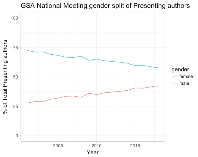 Plot showing increasing participation of female presenting authors over the last 18 years While there are some caveats to the data I accessed:
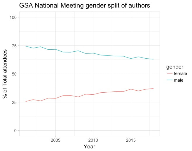 Gender distribution of all authors. Still shows a positive trend toward equality, but at a slower pace. This plot shows the gender distribution of all authors (much larger pool) than presenting authors. It is likely that as this would sample the Geology population, which probably is increasingly male as you go back in generations, the rate of increasing female participation looks muted. Whereas, for the presenting authors, this is a smaller, and perhaps younger, population so the effect is more apparent.
It looks like the trend is positive but at the National Geological Society of American meetings there is still an imbalance in the gender distribution of both authors overall and presenting authors. Something to keep in mind when convening a session, thinking about who to invite to give a talk and who female geoscientists see presenting. Also for the men reading this, ask yourself "why is the room predominantly men or why are all the speakers I am seeing male?" when you're next at a meeting. What can you do to help make our science more inclusive and representative? code and data
0 Comments
Leave a Reply. |
