|
In a previous blog post, I examined the distribution of gender for invited speakers at the 2018 Geological Society of America Meeting. I did this by hand with the conference schedule printed out. But I wanted to go one step further and see if I could extract long-term trends in GSA participation and parse gender from this data. Unfortunately, GSA does not seem to track this in any public way, so I had to resort to webscraping the 18 webpages (going back to 2003) that contain data on GSA attendees:
Motivating question:
Two months of free time and a stack-exchange question later and I have some results. 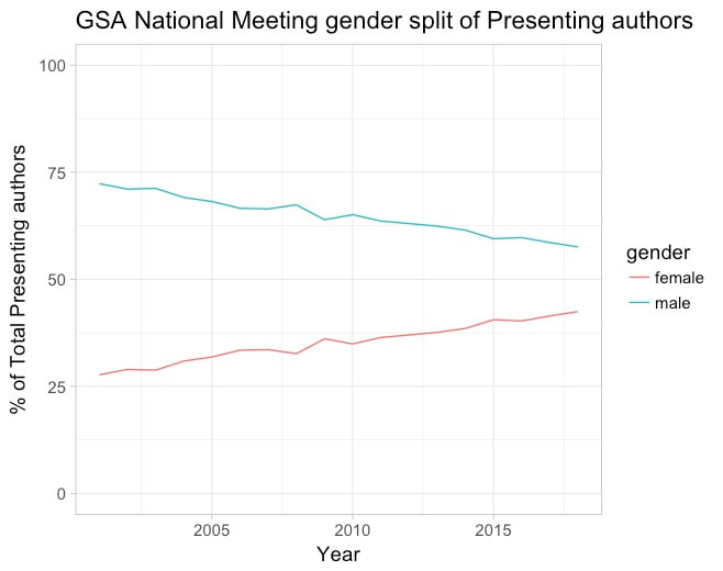 Plot showing increasing participation of female presenting authors over the last 18 years
0 Comments
I recently attended the 2018 Geological Society of America meeting. While there, I got curious about the gender ratio of Invited Speakers. As I am convening a session at a 2019 meeting in Portland, I have been reading about the gender-inequity at conferences. There are quite a few articles on this: 1) Science Magazine 2) Nature 3) Nature and Immunology So at this conference, some time with the program, and a by-hand count charted in excel resulted in this figure: 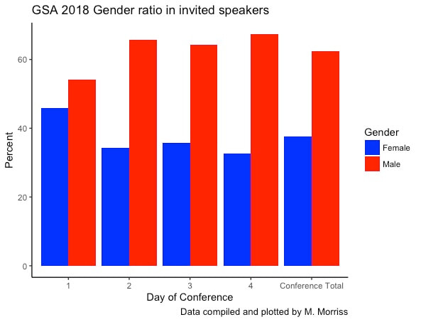 Gender ratio of invited speakers at GSA 2018, by day and for whole conference. I've updated my previous work on Administration numbers (see this post). I added some functionality wherein I now have an R shinyApp up and running that will change the plot to be a Cabinet Level agency of your choice. Check it out and lemme know what you think! 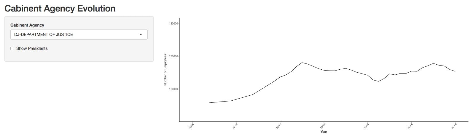 Preview of Shiny app Click to access As a PhD student in Tectonic Geomorphology, I spend a lot of time analyzing topography. One of the tools I have often used is TopoToolBox. This Matlab native toolbox has any different suites of topographic analysis and is specifically geared to analyze river networks. One analysis that I have made use of that is not built into TopoToolBox is comparing the hypsometry (or distribution of elevations) to the slope and relief in each elevation band. I describe herein a tool I developed to approach such a problem, built to work within the TTB environment. 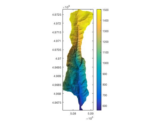 Here is a catchment from my dissertation area in eastern Oregon. Note that there is a sudden increase in the steepness of the topography about 1/3rd of the way from the headwaters to the mouth. 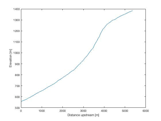 The long profile of this stream reveals a sharp change in gradient, or knickpoint. This knickpoint could be a transient signal, transmitting information of base-level lowering to the catchment above. This means that the slopes above the knickpoint are unaware of the lowering-event the bottom portion of the catchment is feeling. My new function GridCompare, which takes the following inputs:
Example code: load DEM.mat %Load premade example DEM (from above illustration) gridcompare(DEMoc); % run grid compare. The result is below: 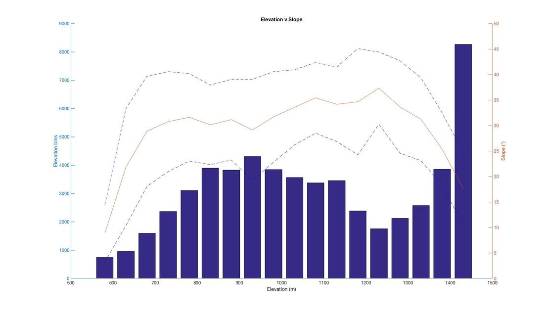 Plot 1: Hypsometry (blue bars) vs the mean slope (red line) and σ-1 of slope (dashed line) in each elevation band. The first thing to note is that there's an accumulation of topography at higher elevation >1400 m. Secondly, this elevation band has much lower slopes than other elevation bands <15° average slopes compared with 25-35° slopes below this elevation 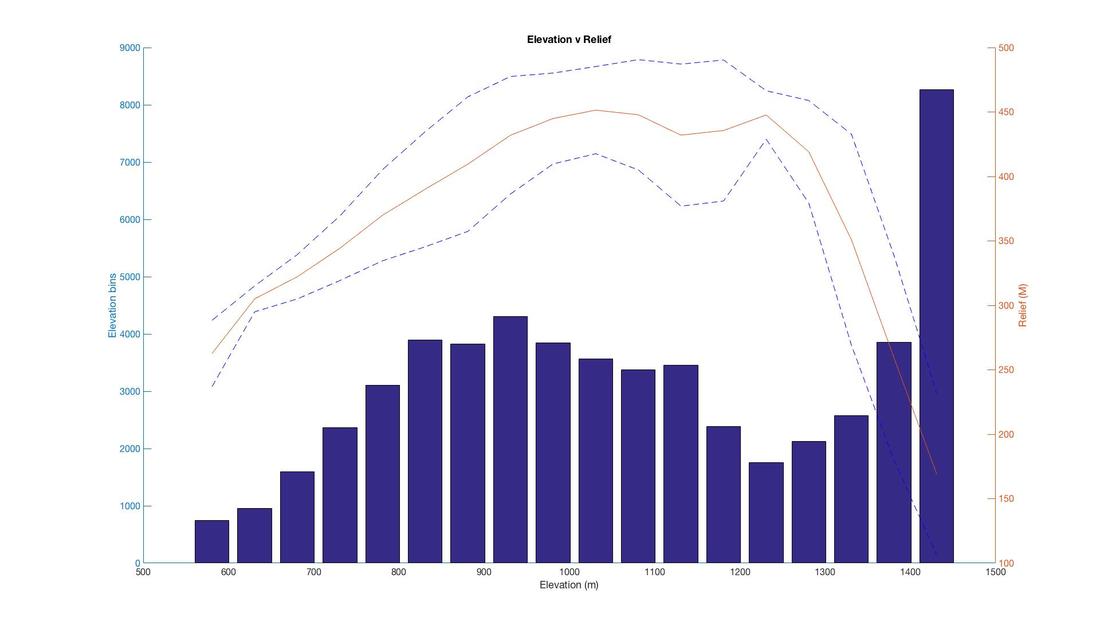 Plot 2: Relief v Elevation. Relief is calculated in a 500 m moving window across the grid. Similar to Plot 1, the higher elevation with greater area has lower relief. To some extent you may expect this trend in non-glaciated landscapes where as you approach the tops of mountains, there is less and less available topography for relief! But the correlation to the higher elevation region is remarkable. This tool is available at my Github Page with this example.
I started this inquiry wondering the following: Are there fewer wilderness areas being created now versus in the past. Using the data I scraped from the Wikipedia page for Wilderness areas, I built on the analysis posted in the first part of this themed blog. Just plotting a time series of wilderness area designation in the lower-48.. 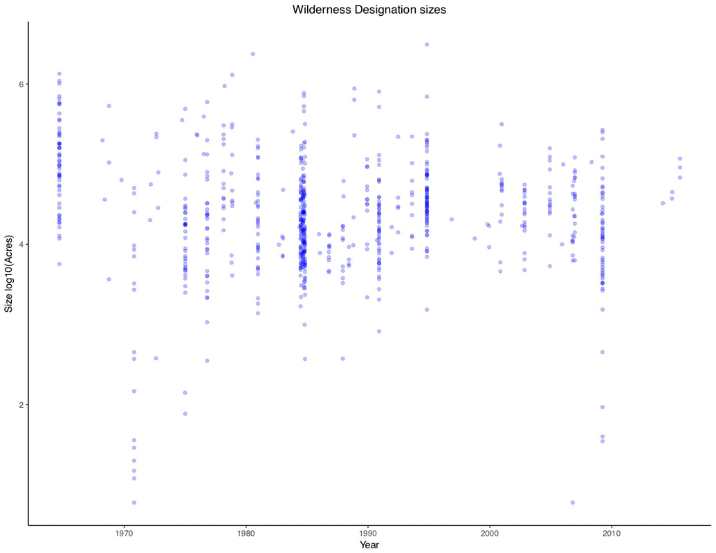 Plot of all wilderness areas created (in Lower 48) since the passage of the wilderness act. Bubbles are transparent to aid in their visualization. The Y axis is the size of each wilderness area. The above plot is interesting but not, perhaps, that informative.
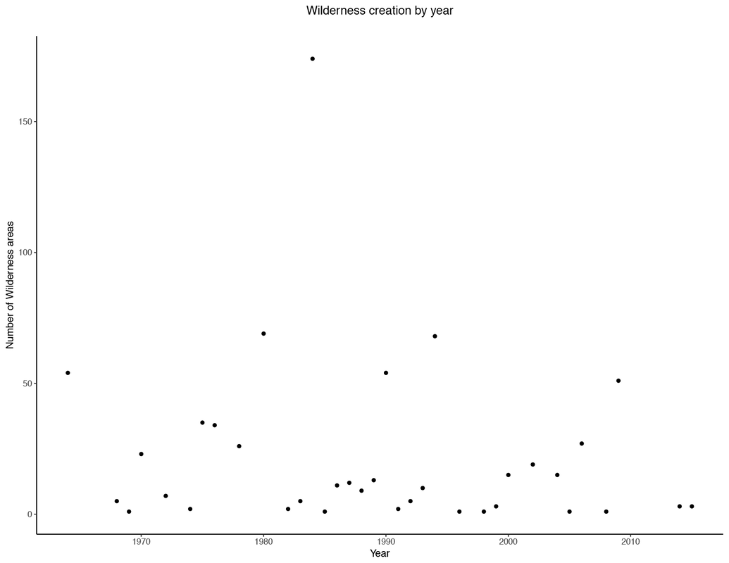 This figure is a count of the number of wilderness areas designated each year. Generally a mean is between 25 and 35. 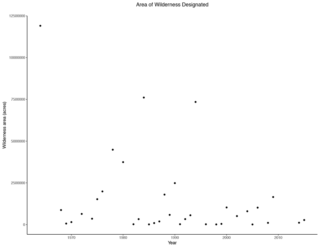 This is a plot of the overall area that is encompassed by the above wilderness areas. While generally similar in shape as the count plot, it is not exactly the same. Visual inspection alone appears to lend itself to both smaller and fewer wilderness areas. However, what our eye sees is dominated by the extremes; the mean area and number is probably fairly consistent overtime. What is the next logical step is to take a look at whether or not there is a robust indication that there are fewer or smaller wilderness areas over time. To do this, I implement a simple regression - in a deterministic sense this requires assuming a distribution a priori. Given that it's hard to have negative wilderness areas (or it was until recently), I chose the Poisson distribution. However, I'm still not sure whether this is the best assumption, given the fact that it would require that the creation of each wilderness area be independent of the previous event. For now, let's say it is. Our null hypotheses would be that 1) There is no reduction in the rate of wilderness area creation or 2) in the size of wilderness areas through time 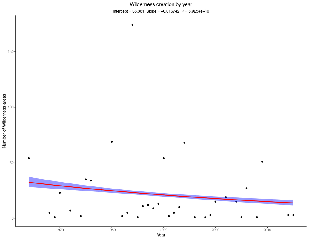 Number of wilderness areas created through time. Negative slope lends itself to that conclusion. 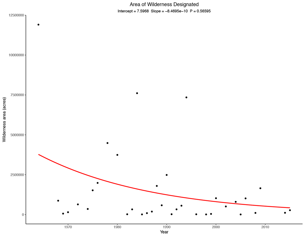 Total area/year designated as wilderness through time. These two regression lines appear to tell two different stories. Both have negative slopes, giving the impression that we may reject the Ho or null hypothesis. However, in this case, I opted for the P-value robustness test.
In the case of the count/year, there is a slightly negative slope to the curve and the P-value is exceedingly small (6.925 * 10^-10). This indicates that our confidence in the slope of the line is high (at the 95% level). Granted there is a lot of variance in the data and not that many datapoints to work with. But an initial conclusion would be that there are fewer wilderness areas being created now than in the 1970s. We can reject the null hypothesis The second regression appears at first to show that there is a similar relationship between year and the area designated as wilderness, and to some extent these variables will likely display covariance as # of wilderness areas is proportional to area. However, there is a higher p-value for this regression (p = 0.5695), indicating that I cannot reject the null hypothesis. The take away: 1) We can robustly say there are fewer wilderness areas being created 2) We cannot say that they are getting smaller.... I hope in the future to approach the problem from a Bayesian sense, if I can figure that out... Code here: https://github.com/morrismc/wilderness |
