|
With all of the events going on right now, horrible wild fires, Covid-19, etc. It may be easy to forget that in the early days of spring, few people were driving and it felt like Salt Lake City had some amazing air quality. There were many articles at the time about how air quality around the U.S. and the world were having a moment during the lockdowns. I got curious now that we are into the later half of 2020, if I could take a rather pedestrian analysis of Salt Lake City air quality monitors and compare the spring of 2020 to other years of the recorded environmental variable air quality index in Salt Lake City. Data source: EPA air quality monitors 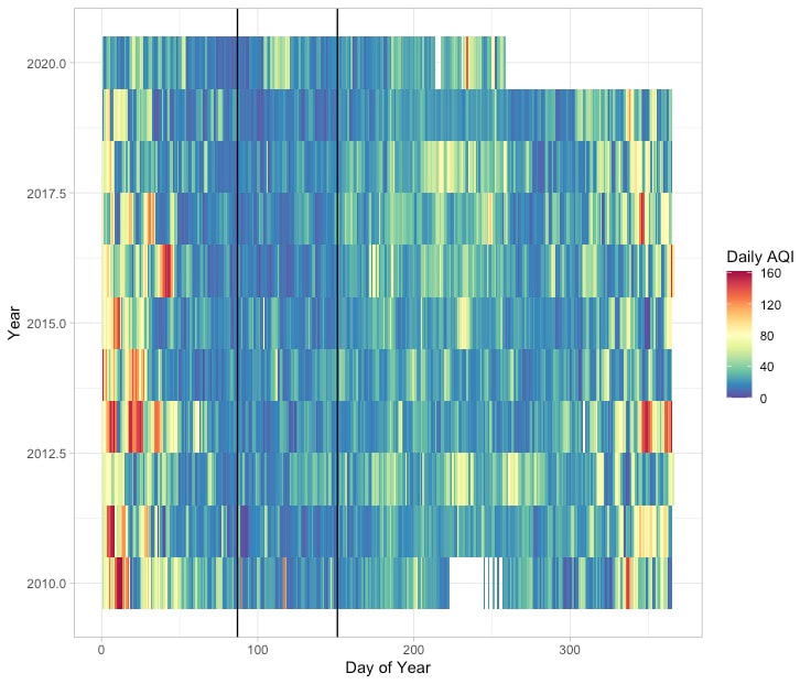 Figure 1. Heatmap of the Air Quality Index (AQI) for 2020 and the past 10 years. Black lines highlight the region when Utah instituted "Stay Home, Stay Safe" when we had minimum car in the Salt Lake Area. The above heatmap shows the annual trends in Air Quality in the Salt Lake Valley. Winter months (at beginning and end of plot) have the highest AQI values (worst air quality), likely associated with the known phenomenon of Winter Inversions in the Salt Lake Valley. The warmer colors mid-summer could be smoke (?) from local or regional forest fires? I know that the very red bar on day ~265 in 2020 and associated warm colors on neighboring days are smoke related. What this heatmap also appears to make clear is that the early months of 2020 had relatively good air quality – even before lockdown started. In fact, the time period between the start and end of 'Stay Home Stay Safe' (black lines) did have a relatively low AQI value but compared with some other years in the same period there was a week or so period with worse air quality at approximately day 100. Despite the very clear air we could see during the lockdown period perhaps it was not cleaner than could be typically expected of a spring in SLC? Will try to examine this below 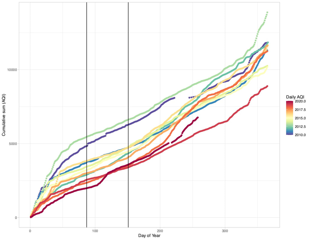 Figure 2. Cumulative AQI for the past 10 years in Salt Lake City (station 490353006). Lines are colored by year. 2020 is the incomplete line with the warmest color. Black lines are the dates over which the State of Utah instituted "Stay Home, Stay Safe." The above cumulative AQI plot shows that of the past 10 years, 2020 was already off to a fairly clean start in terms of air quality (lower slope of the cumulative curve). The slope of the period within the "Stay Home, Stay Safe" dates is actually one of the steepest parts of the 2020 curve, which is remarkable given how many cars were NOT on the road. I'm curious about this event that happened just after day 100 of 2020, but haven't looked at it in more detail. There is also the possibility that reduced traffic from increased working from home throughout 2020 will result in a more systematic change in 2020 air quality in Salt Lake City; however, this would require a more detailed analysis than what I've done herein. Perhaps one the calendar year is up, others will be actively working on this problem (I'm sure the papers will be out soon). 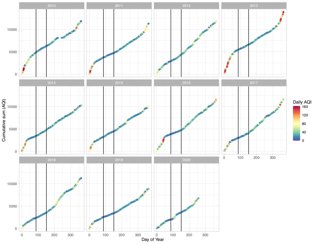 Figure 3. Cumulative Daily AQI by year broken into sub plots. This approach allows for easy comparison between the daily values of AQI responsible for the cumulative curves. The black lines are again "Stay Home, Stay Safe" restrictions. N.B. that the 2020 Daily AQI curve is less steep by day 100 than 2019 and most of the other years plotted. When cumulative AQI is broken out into separate plots for each year, the period of lockdown in Salt Lake is visible more steep, not less steep than at least 4 of the last 5 years. And I would argue (based on visual comparison) that 2020 overall doesn't look like a less steep curve than 2019. In fact, the cumulative AQI value for day 250 in both 2019 and 2020 – 5527 and 6451, respectively, are the inverse of what we might expect if 2020 had cleaner air overall. Clearly a lot of interesting data out there. Curious to see how it will be analyzed in the future. This is a very curious and not super statistically robust analysis. I am excited for more in-depth time-series analysis to be brought to bear!
0 Comments
Leave a Reply. |
